The visual appeal of a brand is the main influence on a consumer's purchase decision. In fact, according to the design portal Canva, the colour and appearance of a product affects 93% of the purchase decision. Furthermore, studies show that the proper use of colour increases brand recognition by 80%. Therefore, when a consumer sees a product or service that has their favourite colour or an attractive colour, most of the purchase decision has already been made.
The psychology of colour
Colour psychology is the study of how colour affects human behaviour, a branch of the broader field of behavioural psychology. This science determines that every colour influences an individual's mood and state of mind. And in the case of marketing, it affects the decision to consume a product or service.
In order to carry out a marketing campaign adjusted to our objectives, it is necessary to determine what image we want to give. For this, the use of colours is going to be fundamental, so we must know what each colour represents.
It should be noted that this may vary depending on the receiver, as other factors such as mood, culture, previous experiences or the time and place in which he/she finds himself/herself influence.
The meaning of colours and their application
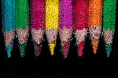
Beforehand, it is important to recognise that there are two ranges of colours: primary and secondary. Within the primary colours we have yellow, red and blue. And within the secondary colours we have violet, orange and green. The way in which we use these colours will be able to generate a greater incitement to buy.
- Blue
The colour blue is associated with the sea and the sky, so it transmits tranquillity and peace. On the other hand, it also represents intelligence, efficiency and coldness. These are just some of the feelings that your clients may feel with respect to your brand.
If your brand is related to health you will find that most of your competitors generally use blue to associate the brand with a quality and reliable product.

- Red
Red is often associated with passion and strength, but also with aggressiveness and tension. It is mostly used to draw attention to a specific element of a campaign, for example for Call-To-Actions buttons such as "Buy now" or "Click here". Red highlights text and images, so use it as a colour to encourage people to make quick decisions.

- Yellow
In colour psychology, the meaning of the colour yellow revolves around sunlight so it evokes feelings of happiness, positivity, optimism, so you can use it, for example, to promote children's products and leisure related items.
Adding a little touch of yellow can help your online shop visitors to associate your shop with something positive, which is the main advantage of the symbolism of this colour.

- Green
The meaning of green is closely connected to nature and money and can represent a more ecological side, as it conveys hope, well-being and peace. It is an ideal colour for environment-related companies and for the promotion of medical and pharmaceutical products.
It is the most soothing colour to the human eye. Use green to indicate stability in your messages.

- Orange
It is the optimistic colour par excellence, it transmits enthusiasm and action. It is a warm colour that is not as aggressive as red, but it has a very high visibility so it is a good ally for CTAs.
It is ideal for young audiences, as it generates confidence and is related to adventure.
It is often used by companies related to entertainment and food, as it is also a colour that stimulates appetite.
![]()
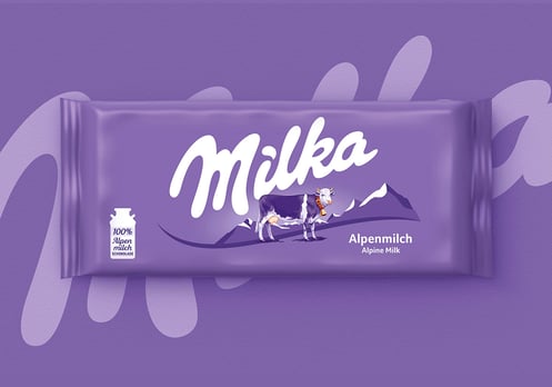
- Violet
In colour psychology, purple is a colour associated with royalty, power, luxury, wisdom and spirituality, as well as mystery and magic.
Within the meanings of each colour, purple is one of the most powerful, so it is often used by brands that want to draw attention or make a difference.
It is a good option for a feminine design or an advertising agency.
- White
When we perceive white, we associate it with aspects of cleanliness, purity and serenity. It is a very combinable colour, so many brands tend to use it for their logos or advertisements together with black or grey. This is the strategy used by brands such as ASOS and Adidas in their digital marketing above all.
On the other hand it is a colour that allows to highlight the others by placing it in the background.

- Black
It is used to transmit power, sophistication and prestige, but it is also related to negative aspects even transmitting fear.
It is an excellent colour especially for haute couture or luxury brands because of its elegance.

Our marketing campaign based on colours
It is important when making a marketing campaign to know the application of colour in different media, as well as the different meanings and emotions that a particular audience can assign to colours. There are many factors that you should take into account.
When making colour decisions, it is important to determine the audience in order to convey the right message and persuade the customer. Remember that colours influence both direct messages and the values and attributes of a brand, so they should be carefully selected when deciding what image to convey.
Marketing uses a large number of tools to condition our purchasing habits, but, without a doubt, colour, due to its undeniable visual appeal, is one of the most effective.