The Gantt chart is a horizontal bar chart showing all the scheduled tasks of a team, company, etc. The Gantt chart was devised and popularised in the early 20th century as a means of graphically representing interdependent processes.
This chart was devised and popularised at the beginning of the 20th century as a means of graphically representing interdependent processes. Although its first ideologist was Karon Adamiecki, who already worked on this idea at the end of the 19th century, the diagram takes its name from Henry Gantt, who modified Adamiecki's ideas and expanded the model throughout the West.
source:Lepatru007
What is the Gantt chart?
As we said, it is a linear representation of the tasks and projects of a company. Up to this point, we could almost speak of a timeline like those used to date historical periods, but the particularity of this diagram is that it shows all the tasks simultaneously, even those that are carried out simultaneously.
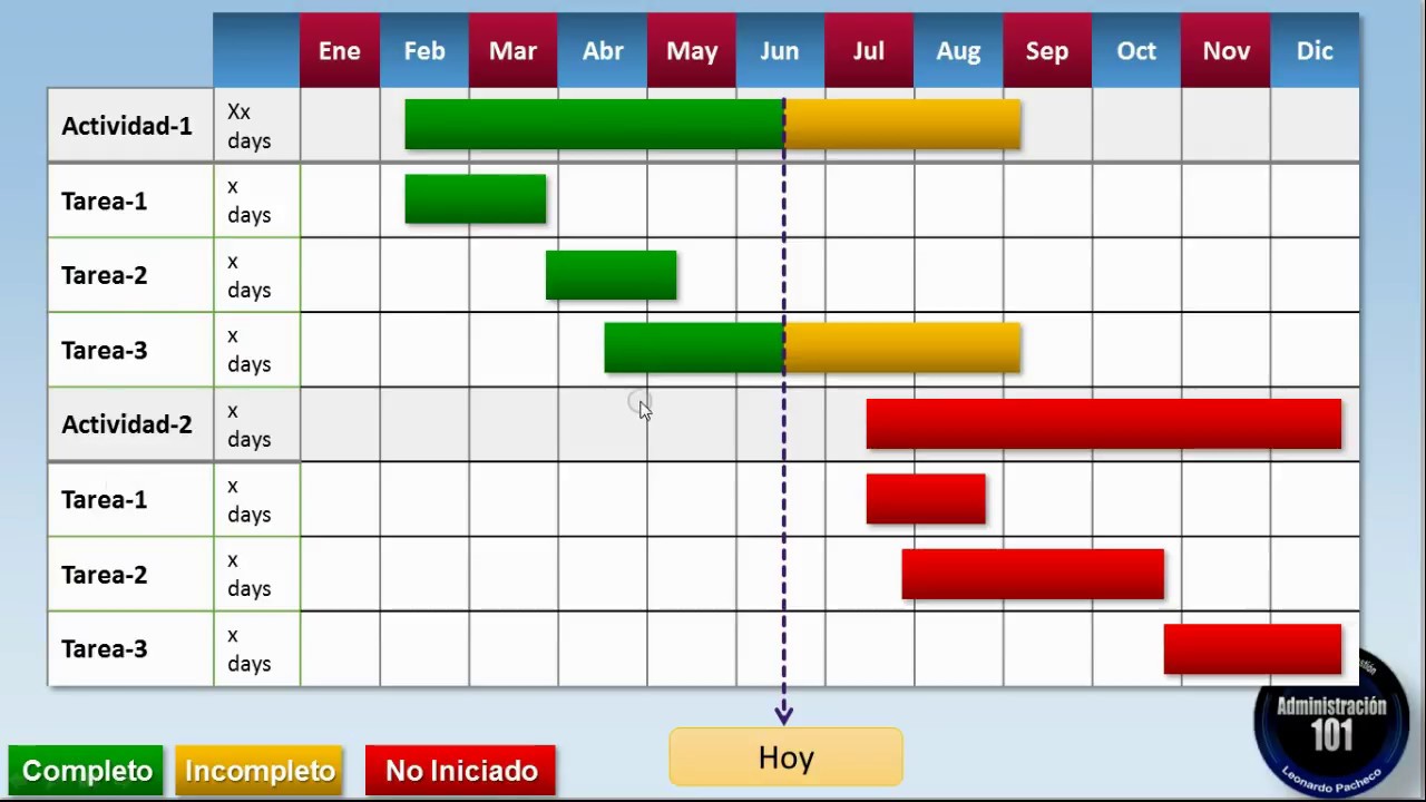
This is the transcription of a table or an abscissa and coordinates axis to a graph. That is, we have two variables, one dependent and one independent, which are arranged in rows and columns or in X and Y axis. The independent variable is time, which is placed in the upper part of the table (giving rise to the columns) or in the X axis of the graph. On the other hand, there are the tasks that are distributed over time (and depend on it). These are placed in the left part of the table (giving rise to the rows) or, failing that, in the Y axis.
Let's imagine a table with days and tasks, each task would colour the boxes of the days it is going to be carried out. This way, when we have completed all the tasks, we will get a global visualisation of which projects start earlier, which are their final deadlines and which tasks will be carried out at the same time.

Source: Vennpage
The diagram shows:
- Start date of a task: you will see it at the top of the table (or bottom of the chart) and you will know that it means the start of a task because prior to that date the space will be blank.
- End date: this is the end of the task because it is the last box or point on the axis to have a task bar. From that point onwards, the space will be blank.
- Who is in charge of it: depending on which programme or tool we use to create the diagram, we will place the name of the team or person in charge of the task in one place or another. This way we will be able to find and contact that person quickly and at the same time avoid overlaps.
- Which subtasks must be completed within the project: The tasks or projects do not consist of a single action, but of several. That is, within the project of planting a tree, the first thing is to get the seeds, then dig the hole, plant them, and water. Each of these stages will involve a cut in the axis that represents the task of planting a tree. Thus we will see that the subtasks do not overlap and that the order is correct but, at the same time, we can observe that if the lower task is to mark each planting with its name, this cannot be done at the same time as the trees are planted, nor before, only after. This is how we can see if any of the tasks is out of order or impossible to carry out.
- Start and end dates of these tasks: Like the tasks, the subtasks are delimited by the start and end dates shown on the cut of the task axes.
- Overlaps: There are tasks in which there are no impediments if they overlap because they are independent of each other. In fact, this is one of the major advantages of this diagram over others.
However, it should be borne in mind that it is a general organisation , the activities are not detailed or in depth, just named and ordered. The result is that you can see which tasks start earlier, which will take longer, which are more collaborative, which tasks occur at the same time. The timeframes that appear in the diagram correspond both to how long the task is expected to take and the deadline by which it must be completed.
Advantages of the Gantt chart:
- Organisation: It allows you to organise your company's tasks and projects with the whole team in mind. You can see what phase of the project each team is in at any given moment and, depending on the time modifications that may be necessary, check which teams are more efficient. By visualising all the tasks together, the company ensures that everything necessary to carry out a project is ready before its deadline.
- Foresight: The Gantt chart is a way to be prepared for the next actions the company has to carry out.
- Flexibility: Projects may undergo changes during the process but, thanks to the overview provided by the Gantt chart, the necessary task(s) can be rearranged so that they do not interfere with other tasks, deadlines are still respected, etc.
- Possibility of change: Being able to visualise all the tasks as a whole and that their visualisation is in an editable programme allows the company to move the dates of the tasks.
- Overview: By overview we refer to the possibility of observing all the tasks and projects that a company is developing and will do in the future; but also to the benefit of this diagram being open access to all workers.